Growth hacking the Klarna Card
The Klarna Card is a Visa card that use Klarna’s payment options, so its cardholders can pay with Klarna anywhere.
As part of the Product Growth team, we increased the Klarna Card's user base by 180%, year on year.
Here are a few initiatives that got us there.

Testing & experimentation
In some markets, the Klarna Card is four years old, yet there has been little to no systematic testing on the most effective copy, benefits, or channels to reach our users. I developed a multi-variate testing framework built around at least 3 copy variants.
This framework was used whenever we tested a new channel. We used to it write multiple subject lines for emails. The most effective variants were applied or tested elsewhere. I added the results and recommendations to a wiki page for the rest of the org. Here’s an in-app message test.

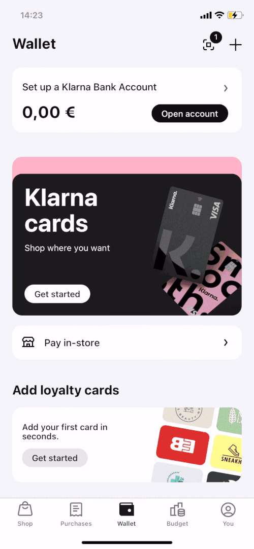
Improving the onboarding experience
Next, we improved the onboarding screens where a user lands after they’ve tapped on a CTA.
The original version used a carousel functionality, and the user wouldn't see a call-to-action to tap until the end of the carousel — meaning it took four swipes before someone could sign up for a Klarna Card after tapping a CTA.
To improve this experience, we cut it to one screen, showed the CTA immediately, and anchored it to the bottom, even when the user scrolled down. I tightened up the copy, and the main benefits were front and center. Drop-offs dropped off.
After
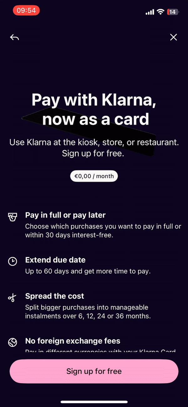
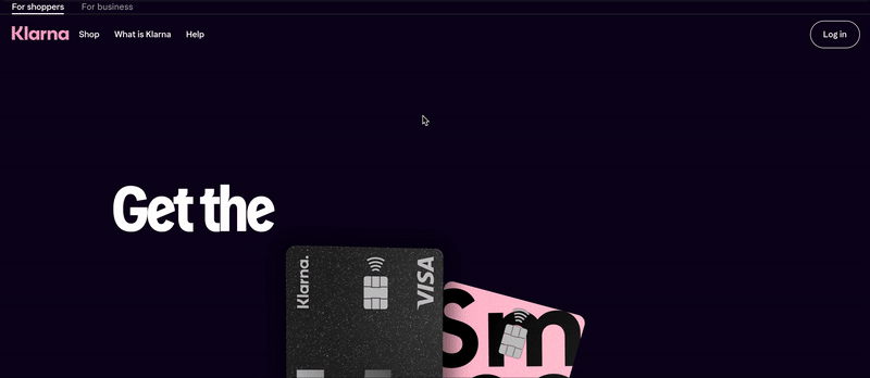
Updating messaging and landing pages
As the Klarna Card developed, I consistently punched up the product messaging based on the product itself and our evolving understanding of the user. After gathering feedback from product marketing, I’d apply the fresh copy to various channels, including the landing pages. Here’s how the messaging and our design improved over the years.


Travel: Business goals vs. user needs
Klarna's vision for the Klarna Card was for it to be an everyday card for everything from big-screen TV shopping to paying for a morning coffee. A noble business goal, but this wasn't the reality for many users.
Looking at the analytics, we noticed high spending rates in other currencies. With flexible payments and a great currency exchange rate from Visa with no fee, the Klarna Card was an ideal travel card. So, we campaigned on this use case, outperforming our other always-on CRM journeys.

Travel landing page

Travel email - 1st touch

Travel email - 2nd touch

Travel in-app message

App home hero card

Travel push notification